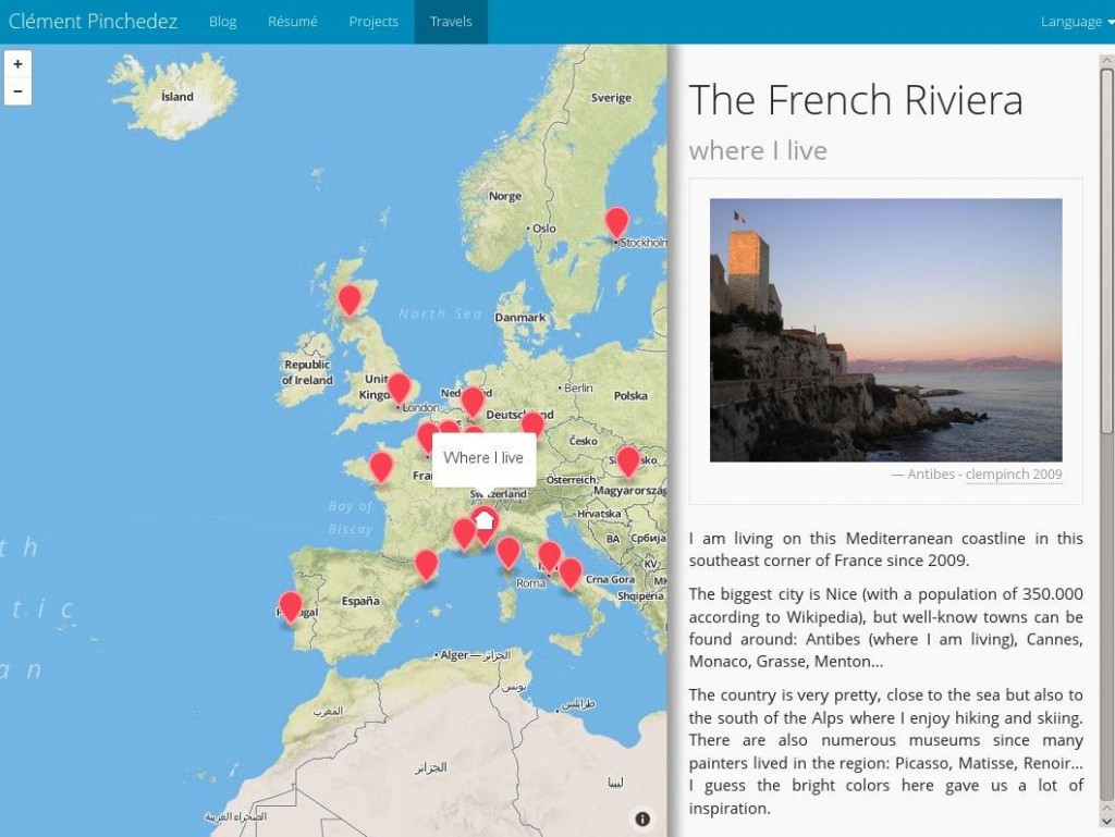
Recently I used the Mapbox.js library to create an interactive map for my personal website. The idea was to have a map with all the places I have been to.
In fact, I was very pleased by the clarity of the documentation of this API. Also there are very good examples to get inspired by. Although I am not calling myself an expert in Javascript and Web programming (and above all, cartography is a complete new world for me), I felt pretty confident to integrate this API to my website after reading the doc and then starting using the library in my code.
I had very few problems to add the map to my website, add a few locations (aka as markers) and associate some click event to it.
Here is how I proceeded.
The Javascript file:
// create the markers
var geoJson = {
    type: 'FeatureCollection',
    features: [
    {
        type: 'Feature',
        properties: {
            title_en: 'Paris',
            title_fr: 'Paris',
            page_en: 'paris_en.html',
            page_fr: 'paris_fr.html',
            'marker-color': '#fc4353',
            zoom: 6
        },
        geometry: {
            type: 'Point',
            coordinates: [2.351828,48.856578]
        }
    },
    {
        type: 'Feature',
        properties: {
            title_en: 'Marseille',
            title_fr: 'Marseille',
            page_en: 'marseille_en.html',
            page_fr: 'marseille_fr.html',
            'marker-color': '#fc4353',
            zoom: 6
        },
        geometry: {
            type: 'Point',
            coordinates: [5.369889,43.296346]
        }
    }
    ...]
// create the map
var map = L.mapbox.map('map', 'clempinch.he1g7m56').setView([34, -37], 3);
// customize the marker events
map.featureLayer.on('layeradd', function(e) {
    var marker = e.layer;
    // custom popup content
    var popupContent =  getTitle(marker);
    marker.bindPopup(popupContent,{
        closeButton: false
    });
    // customize click event
    marker.on('click', function(e) {
        // zoom on the marker
    	if(map.getZoom() > marker.feature.properties.zoom) {
    		map.setView(e.latlng, map.getZoom());
    	} else {
    		map.setView(e.latlng, marker.feature.properties.zoom);
    	}
        // jQuery to update the content of a particular div with some other content
    	$(function () {
    		$("#travel-div").load(getPage(marker)).hide().fadeIn('slow');
    	});
    });
});
// load the markers in the map
map.featureLayer.setGeoJSON(geoJson);
// popup behaviour on marker mouseover event
map.featureLayer.on('mouseover', function(e) {
    e.layer.openPopup();
});
map.featureLayer.on('mouseout', function(e) {
    e.layer.closePopup();
});
I solved the problem of localization by attaching ‘language-dependent’ attribute to the marker object (e.g. page_fr/page_en or header_fr/header_en), then the getTitle() and getPage() method retrieve the correct field given the language of the hosting page:
// language
var lang = document.documentElement.lang;
// by default english language
function getTitle(marker) {
	if(lang == 'fr') {
		return marker.feature.properties.title_fr;
	} else {
		return marker.feature.properties.title_en;
	}
};
The HTML would look like this:
<html>
  <head>
    <meta charset=utf-8 />
    <title>Travel Map</title>
    <meta name='viewport' content='width=device-width, initial-scale=1.0, maximum-scale=1.0, user-scalable=no' />
    <script src='https://api.tiles.mapbox.com/mapbox.js/v1.6.2/mapbox.js'></script>
    <script src='lib/jquery/jquery-1.10.2.js'></script>
    <script src='travel_map.js'></script>
    <link href='https://api.tiles.mapbox.com/mapbox.js/v1.6.2/mapbox.css' rel='stylesheet' />
    <link href='lib/bootstrap/bootstrap.css' rel='stylesheet' />
    <link href='travel_map.css' rel='stylesheet' />
  </head>
  <body>
    <div id='map'></div>
    <div id="travel-div">
    <h1>That's where I have been...</h1>
    <p class="visible-lg visible-md"><i class="fa fa-arrow-left"></i> Click on places on the map to get some details.</p>
    <p class="visible-sm visible-xs"><i class="fa fa-arrow-up"></i> Click on places on the map to get some details.</p>
  </div>
  </body>
</html>
Note that I use Bootstrap for the style and the layout.
And here is the CSS I set in addition:
#map {
	position:absolute;
	top:40px;
	bottom:0;
	width:60%;
}

#travel-div {
	position:absolute;
	padding-right: 1em;
	top:40px;
	bottom:0;
	width:38%;
	margin: 1em 62%;
	overflow-y: scroll;
}

@media screen and (max-width: 768px) {
   #map {
    height:50%;
    width:100%;
  }
  #travel-div {
  	padding-top: 1em;
    margin: 5%;
  	top: 55%;
  	height: 50%;
  	width: 95%;
  }
}
The block with @media... is for a “responsive design” – i.e. switching from a vertical to an horizontal division of the panels when the size of the screen gets smaller (i.e. lower than 768px).